
A 1.5-week project to improve their existing WhatsApp integration flow, successfully reducing clicks by 1/3 and increasing the number of users submitting their personal details.

Figma

Slack

Zoom

Google Meet

Unplex is a platform by people who understand the challenges of trying to stay financially involved in their community while living abroad. The mission is to eliminate pain points of international transactions.
Founders are all of Indian descent, living in the US, so the initial launch will be geared towards these communities, with the intention of expanding in the future. With community as a key focus, Unplex works with users sending money via phone numbers rather than needing the recipient's bank details.
Why WhatsApp Integration
WhatsApp is the most used app globally, especially India. Lots of Indian businesses operate on WhatsApp platform so the company expresses their needs at the kick-off meeting. They want to keep WhatsApp flow for impulse sending and the feature will still be an essential part of the product even when they develop a native app.
Original WhatsApp Flow
The older flow contained 6 main steps and 16 decision points in total for the first-time user to send the money.


Improvements to the overall UX writing based on the original flow to better suit a banking platform, removing unnecessary steps and sticking with essential data we need to onboard first time users. As a result, we reduced clicks by one-third to shorten the time in task.


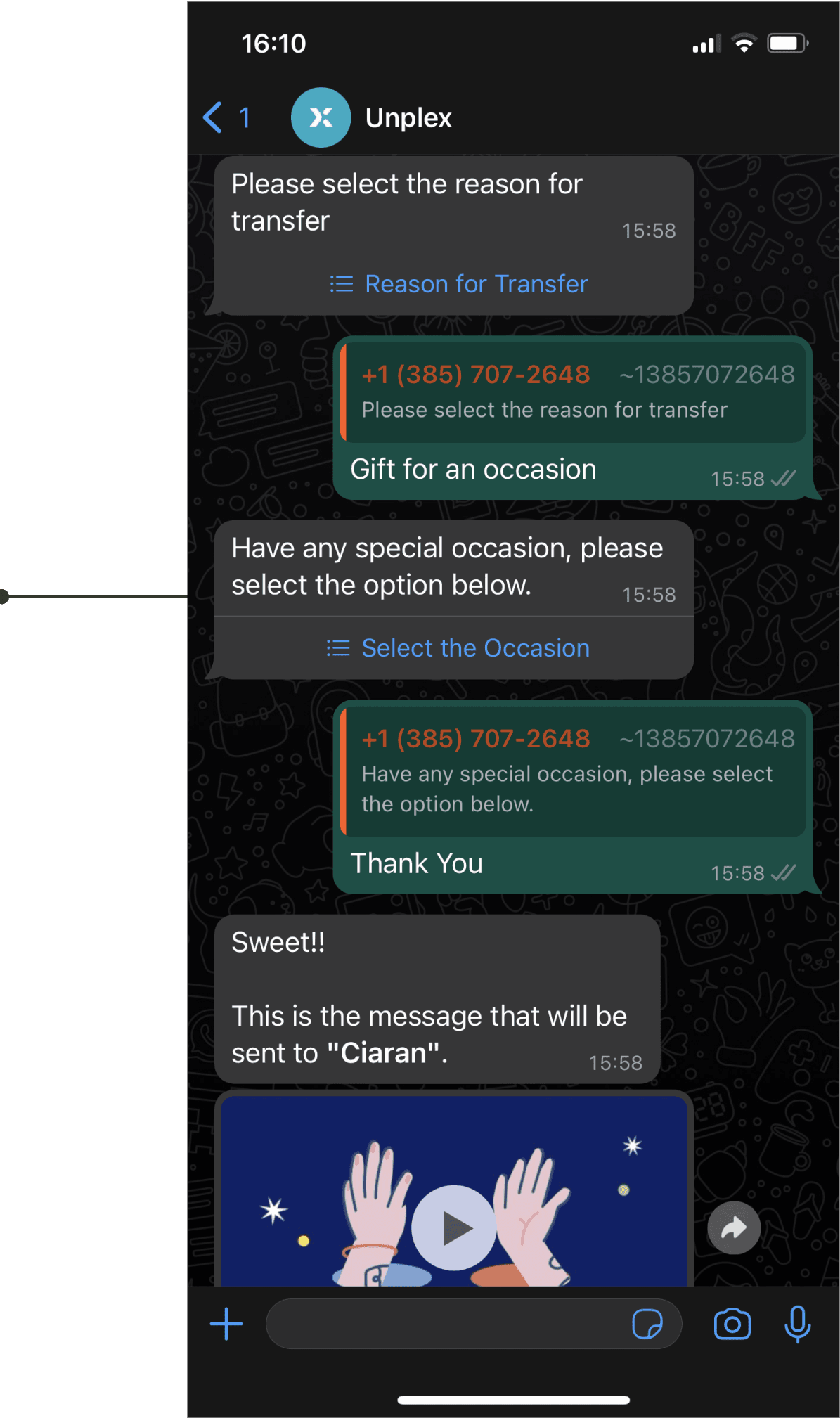
Remove the GIF feature
The GIF feature intends to add a personal touch for users, but its lack of personalised choices takes away its meaning.

Add ‘Register Now’ CTA on landing page
Research shows some users dropped out from the process because original flow made the users keep switching between WhatsApp and the website. New version provide an option for users to register phone numbers and personal info at the beginning to prevent too much switching.
Initial Research
Chatbot Analysis
Teardown Workshop
Redesign
Interactive Prototype
Evaluate
Usability Testing
Last Iteration
Deliverable
As I have to know more about WhatsApp as a business platform, I found out there were some challenges in building products on the WhatsApp platform.
Restrict templates on the whatsApp business platform:
There are some templates you can use in the platform, if the company would like to create a new one, the new template will need to be approved by WhatsApp platform.
Personal information must be filled in a secure website:
Redirect users to a secure website to fill in the personal information is required and it can not happen inside WhatsApp.
To understand how a chatbot conversation flows naturally and optimise the user experience, we examined Haro, a virtual assistant for a Hong Kong bank. This gave us valuable insights into how effective UX writing can build user trust and informed us about the features and templates we could implement on the WhatsApp Business platform.

We went through as a team and gave our thoughts on each message, dissecting how information was written and at what point should this information be given to us.

‘More’ CTA being bigger than ‘send’ and ‘request’ didn’t give a clear indication of what the main features were.
The first welcome message had too many emojis that weren’t necessarily adding any extra value to the message.
For people less confident on WhatsApp we felt that this could be made clearer.


Is it necessary to select reason and occasion at the same time?
We then figured it out, by choosing the occasion would generate the GIF below but we felt the auto-generated GIF was lacked of personal touch.
From the initial client meeting, clients told us to review the current process in WhatsApp and made changes using our knowledge and expertise in UX. So we made some quick changes based on our assumption about how information should be organised and how the user experience should be written and made an improved interactive prototype to test with users.
At this stage, the users from the client list have already tested the initial flow. Therefore, we have decided to validate the new changes with them.
Improve the CTA hierarchy
Before

After

Display important info in a clear way
Before

After

Give user option to include the GIF feature
Before

After

Evaluate
To figure out what was the reason users didn’t continue the process and the 10 usability tests lead us to 3 main problems.
“This GIF is not personalised... I want to remove it but this has already made me lose interest”
“I’m not sure I would use this feature...”
We noticed that the gif feature was the point in the user journey that caused the most frustration. Participants began by not fully understanding what or why they were adding this to their transaction. Then at the end, if they’d changed their mind, there was no option to delete.
“I want to register all at the beginning, this makes me feel like I’m getting scammed”
We discovered that users lose interest when the WhatsApp flow redirects them to a website to enter personal information. Some users even felt like they were getting scammed when clicking the link in WhatsApp.
“I do worry I may drop out if it makes me work too hard.”
The user felt that they were being asked to do too much in the entire flow all at once, and they were unsure about the duration it would take.
Based on the insights that gathered from usability testing, we started last round of iteration and handed over the design to the client and move on to the next phase due to the time constraint. There were 3 major changes we make from the data we collected:
Remove the GIF features
We have decided to remove the GIF feature based on user feedback. The feature was not providing any additional value and was only adding extra clicks for users.
Add one register point
We found out some users dropped out of the process because we made the users keep switching between WhatsApp and the website and made the whole process too long. We provide an option for users to register phone numbers and personal info at the beginning to prevent too much switching and users don’t need to do register and payment at one go.
Simplified and divide the flow to the register flow and payment flow
We combined pages and rearranged the order based on our users feedback. We also ensured that the page numbers at the top reflected where the user was within their flow, and there weren’t any surprise screens popping up when you thought you were about to reach the last phase. We then separate the two flows so that users don't feel exhausted by the time they reach this task.
Before
Register flow + Payment flow

After
2 steps for registration flow
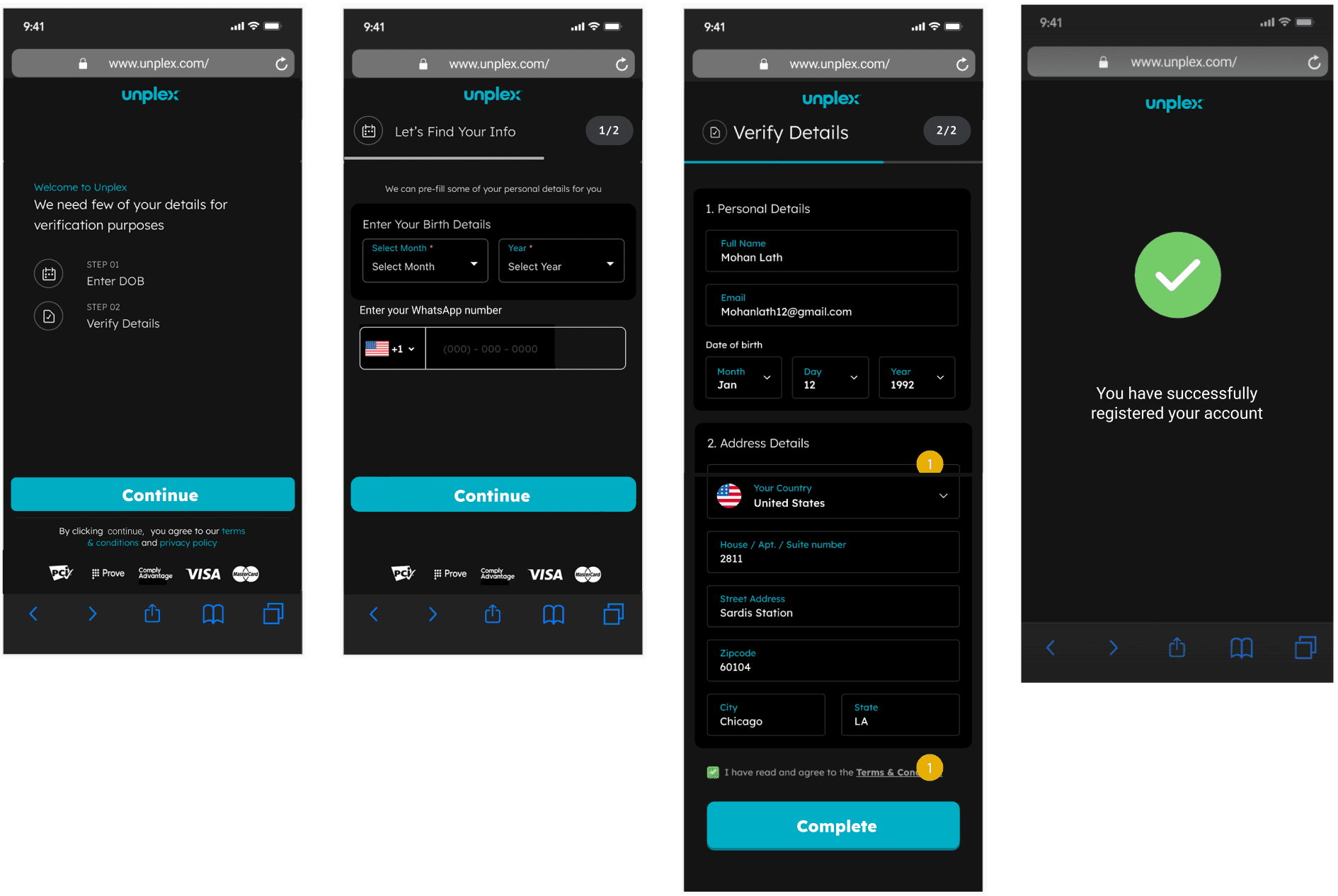
1 simple step for payment flow


Next Steps
For the client project, we only had 1.5-week to work on WhatsApp integration then we had to move on to native mobile app sprint, so the ideal next step would be doing A/B testing and validating the changes and comparing it to the original data.
The clients were surprised by the number of steps in the user flow at the beginning. They recognised the importance of usability testing and agreed that the gift feature is not necessary from the user's perspective and they agreed to pass the design to the developer to make it live.
We believe that shortening the flow and consolidating the registration process into a single point can increase the number of users inputting their information, thus addressing the original problem.
Key Learnings
During this sprint, I learned how to work with technical constraints , and conducting more research helped to reduce friction. We encountered limitations when redesigning this feature, which sometimes made it challenging for users. However, we just have to find ways to have a balance between user needs and business requirements.